The Challenge
The Field Museum’s public-facing website is the digital front door for one of the world’s largest natural history museums. However, the site had become a source of organizational frustration and missed opportunity. Technically, the site was inflexible, forcing workarounds with the content management system (CMS) that made updates a constant struggle. Visually, stakeholders wanted to reduce the overwhelming use of primary blue and expand beyond a rigid brand application without fully rebranding. But the most critical issue was representational: the museum’s world-class scientific research, events, and active programming were virtually invisible online, reinforcing a public misperception of the institution as static and old rather than vibrant and alive. Collections remained buried on separate micro-sites, events were hard to find, and the site failed to serve its diverse audiences—from families planning visits to researchers seeking scientific content. With hundreds of pages to reorganize and years of struggle around website improvements, the challenge was to not just redesign the website, but create a flexible, living system that could continuously evolve with the museum’s needs.
Our Expertise
The Solution
We delivered a comprehensive website redesign built with a robust design system that transforms the site into a living, continuously evolving digital platform. The solution centered on three key pillars:
- A complete information architecture overhaul that created clear pathways for different audiences
- A vibrant visual design system that extended the existing brand into a more dynamic, expressive language
- A modular content block library with flexible templates that make ongoing content updates efficient and scalable.
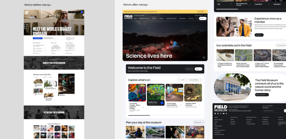
The website finally feels like The Field Museum. It’s cleaner, easier to navigate, and better represents the energy and expertise of the people who work here. And it gives us a solid foundation to iterate on.
STRATEGY
Building buy-In, transparency, and a scalable system
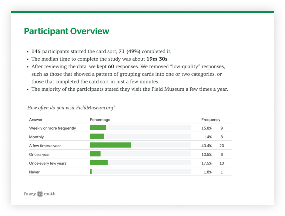
Our approach balanced user research, technical constraints, and organizational dynamics to create a solution that would work for the museum long-term. We conducted user surveys and interviews to validate visitor needs—focusing on the gaps from our previous strategic work —and used those insights to inform everything from navigation design to content priorities. A rigorous information architecture process ensured the new structure would serve both casual visitors planning trips and researchers seeking scientific content.
For the visual design, we carefully extended the existing brand rather than rebranding, creating a fresh, dynamic aesthetic that could make a strong visual impact while staying within the guardrails of the existing brand.
Throughout the project, we maintained monthly stakeholder meetings to build buy-in across the organization and address the institutional skepticism around website work. Close collaboration with the external development team ensured our modular design system was technically feasible and CMS-compatible. By approaching this as a system rather than just a redesign, we created a foundation that the museum can build on iteratively, implementing additional opportunities from the strategic roadmap as the site continues to evolve.
Key Takeaway
Our previous strategic work with the Field Museum taught us the importance of establishing shared frameworks that the entire organization could reference and trust. At the start of the website project, we created foundational artifacts—design principles, visual design direction, and content guidelines—that translated strategic goals into concrete decision-making tools. These assets became our north star throughout the project, ensuring alignment across stakeholders and empowering our partners to advocate for design decisions with clarity and confidence.
DISCOVERY
Visitor research revealed buried content
We conducted surveys and interviews to validate the user needs we’d identified in our strategic work, focusing especially on the visitor experience. Key findings revealed that users relied heavily on the website for visit planning but faced significant friction. We heard that temporary exhibitions and special events were major visit drivers, but remained buried on the site. We also learned that different audience groups needed distinct types of support: parents wanted family-focused content while science enthusiasts sought deep dives. These insights confirmed that showcasing the museum’s active programming and science work weren’t just an internal priority—they were what users wanted to see.
DESIGN
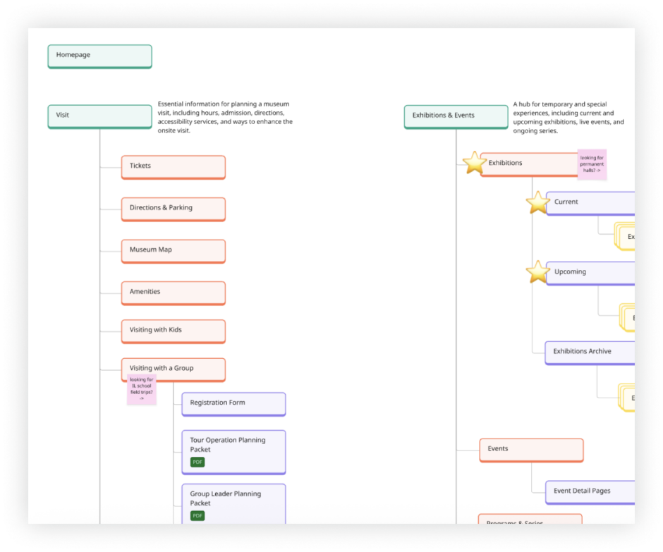
Building a scalable information architecture
Through a comprehensive process of content auditing, card sorting, and tree testing, we reorganized hundreds of pages into a logical structure to serve multiple audiences. We elevated temporary exhibitions and events, created distinct pathways for scientists versus the general public, consolidated collections microsites into the main site, and established new sections for active research, repatriation work, and departmental content. The result was an architecture that makes content discoverable, scalable to future additions, and reflective of the museum’s full breadth of work.
DESIGN
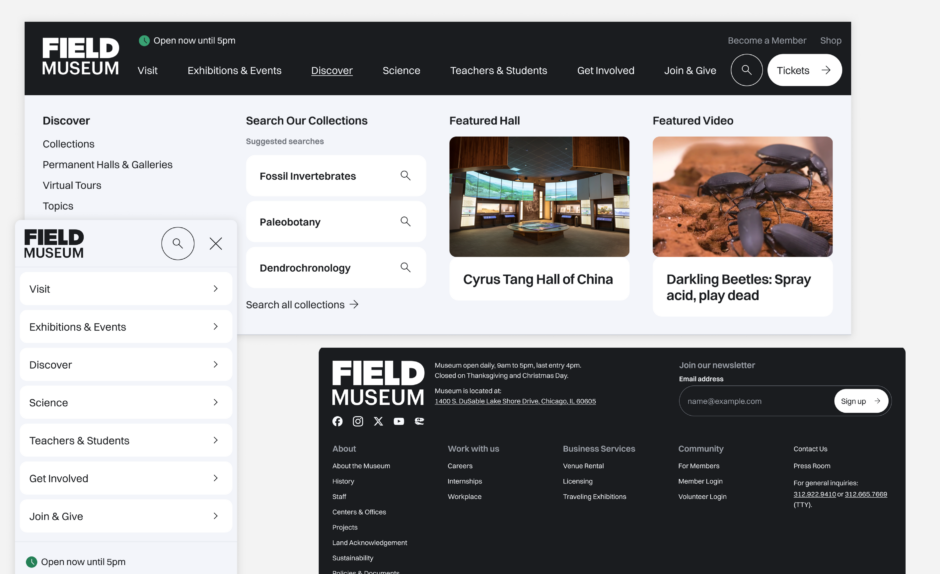
Navigation that increases discoverability and curbs overwhelm
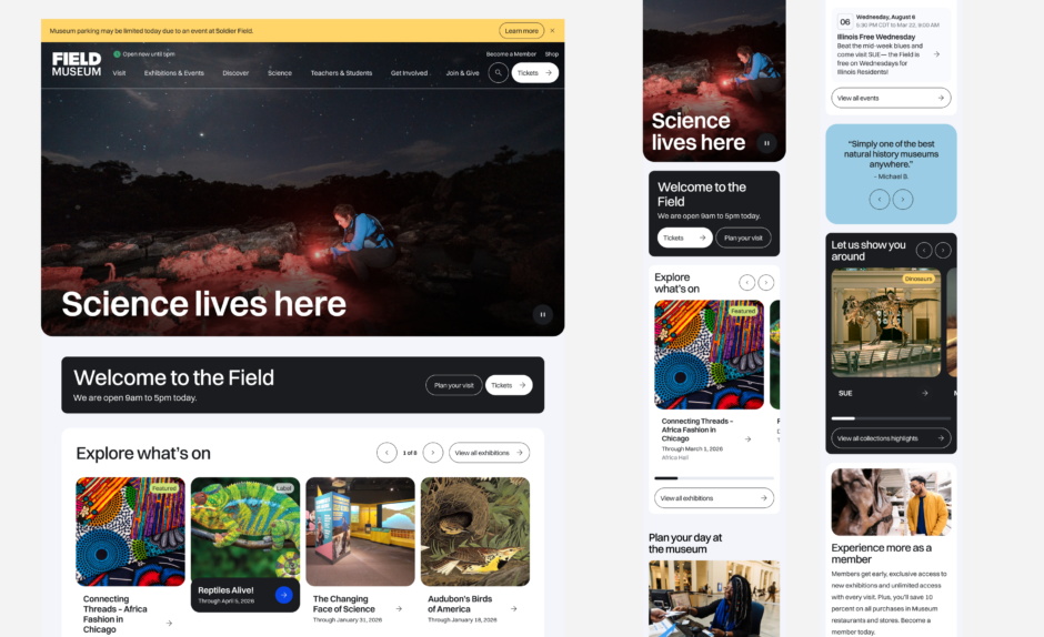
Building on the updated, re-organized information architecture, we replaced the old, overwhelming mega menu with more economical navigation drawers that let users focus on one category at a time. Each drawer features scannable subcategories and strategic showcases for featured exhibitions, upcoming events, membership opportunities, and content like research projects that was previously buried. This approach significantly improved content discoverability while giving the museum a flexible tool to surface what’s most timely and relevant.
DESIGN
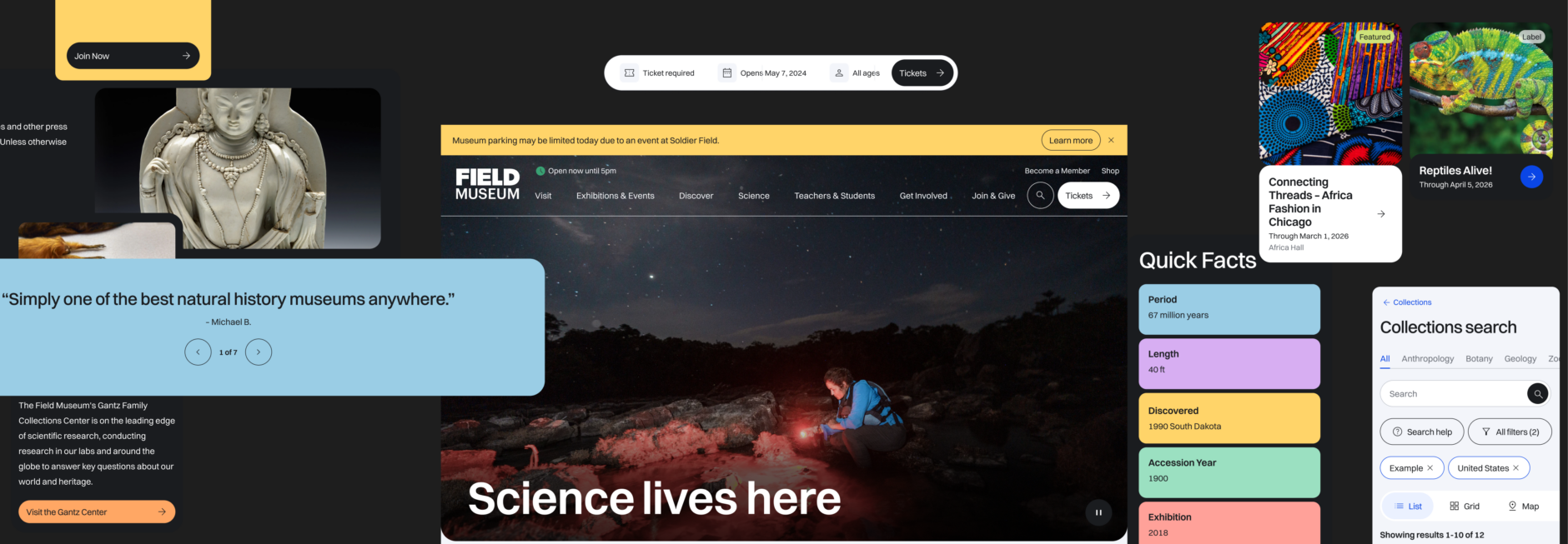
Extending the brand into a dynamic visual system
We extended the existing brand into a vibrant new visual language characterized by sleek layouts, strategic pops of color, motion, rounded shapes, and bold typography. A key priority for stakeholders was dramatically reducing the overuse of primary blue—previously dominating navigation, actions, and footers—to give it real impact where it matters. We introduced higher page density with bento-style containers, warm and conversational interface patterns, and a design direction that feels both modern and approachable, creating immediate visual impact.
DESIGN
Designing a homepage that feels alive
The homepage was a key opportunity to embody the design principles established early on in the process—particularly “vibrant and alive” and “human and connected.” We learned in our previous stakeholder interviews that the museum’s public perception struggled with two key misunderstandings:
- a lack of awareness of the ongoing research and active science work behind the scenes
- the misconception that not much has changed recently, or even since their childhood trips to the museum.
To counter these misconceptions, our goal was to embody the principle of “active and alive”, showcasing the constant activity and discovery happening at the museum. The top banner rotates through not just special exhibitions, but the full breadth of what’s happening at the Field: active research projects, behind-the-scenes science work, educational programming, and special events. We incorporated motion throughout the page to create a sense of dynamism and energy, countering the public misperception of natural history museums as static, dusty places filled only with taxidermy.
To embody the “human and connected” principle, we integrated visitor testimonials that bring authentic voices to the forefront, and used warm, conversational language throughout. The homepage provides clear pathways into key content areas—collections, science, visit planning—serving both the casual visitor looking to plan a trip and the science enthusiast wanting to dive deeper into research. By treating the homepage as a living canvas that constantly reflects what’s new and exciting at the museum, we created a digital front door that accurately represents the Field as an active, world-class research institution.
DESIGN
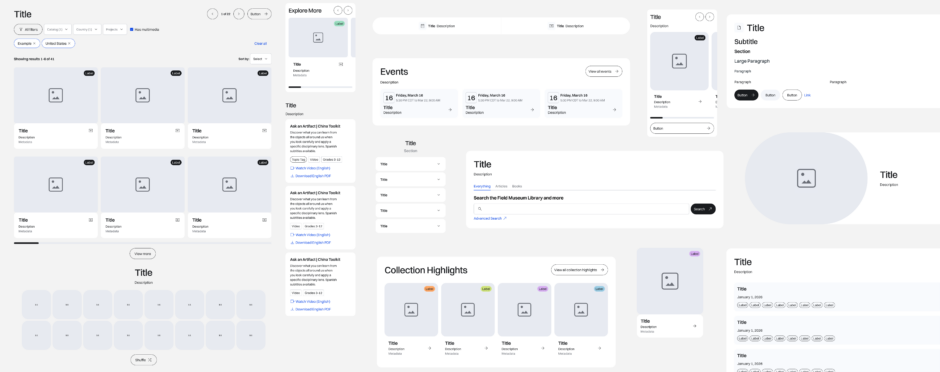
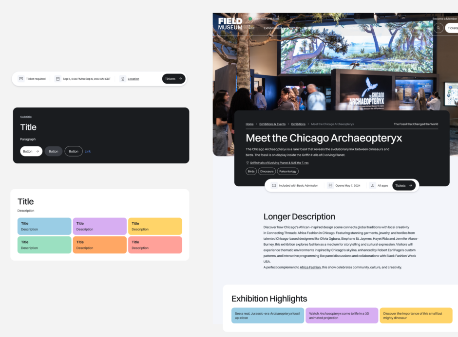
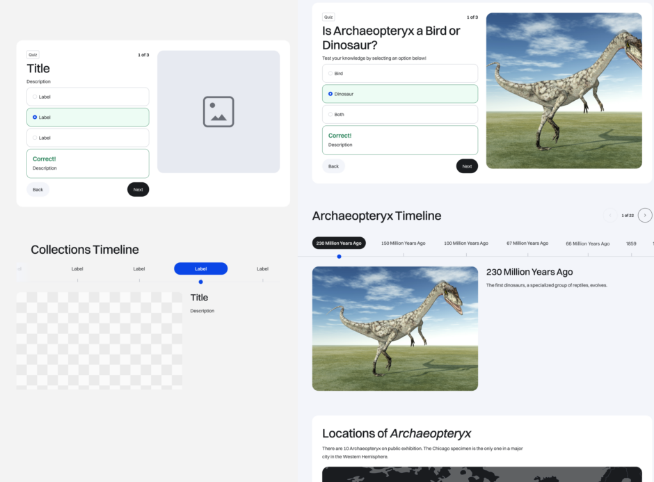
Creating a flexible system for continuous evolution
We built a comprehensive design system and content block library, ensuring all content has an appropriate, well-designed container. The modular system allows blocks to combine flexibly across different page templates, making the site scalable to new content needs.
Through close collaboration with the external development team, we ensured the design system was technically feasible and CMS-compatible. The coordination effort spanned multiple organizations—the Field Museum’s various departments, the development partner, the ticketing vendor, and our internal team—requiring careful project management and clear communication. The result is a fully implemented site that’s measurably more efficient to update, with a flexible foundation that supports the iterative release of additional features from the strategic roadmap as the museum’s digital presence continues to evolve.
Our goal was to create a visual system that sparks curiosity while remaining usable and accessible. By pairing a modular design system with an evolved visual language—using color, motion, and thoughtful UI patterns—we modernized the digital experience without redefining the brand, helping the site feel cohesive, exploratory, and ready to evolve alongside the museum.
Have a project you'd like to discuss?
We'd love to speak with you about your project and how our user experience services can help.
Contact Us