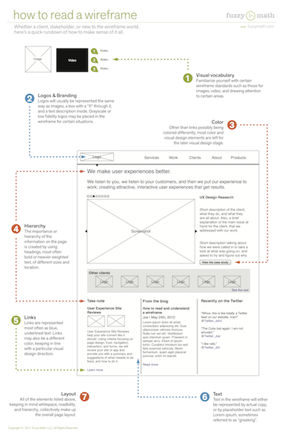
There are tons of great articles out there currently on the subject of wireframes and how to effectively create them. With wireframes not only being a crucial piece of the puzzle for designers but also clients, the gang at Fuzzy Math thought it was about time to present a few guidelines for how to read and understand what exactly is going on in a wireframe.
Reading a Wireframe
Whether new to the world of wireframes, a client or stakeholder being presented one, or just a general fan of wireframe goodness, the best place to start is with the basics. A solid understanding of the pieces that make up a wireframe, will make reading one much easier. Everyone has their own style, but take a look below for a rundown of a few of the basic components to keep in mind:

1. Visual vocabulary
Familiarize yourself with certain wireframe standards such as those for images, video, and drawing attention to certain areas.
2. Logos & Branding
Logos will usually be represented the same way as images, a box with a “X” through it, and a text description inside. Grayscale or low fidelity logos may be placed in the wireframe for certain situations.
3. Color
Other than links possibly being colored differently, most color and visual design elements are left for the later visual design stage.
4. Hierarchy
The importance or hierarchy of the information on the page is created by using headings, most often bold or heavier weighted text, of different sizes and location.
5. Links
Links are represented most often as blue, underlined text. They may also be a different color, keeping in line with a particular visual design direction.
6. Text
Text in the wireframe will either be represented by actual copy, or by placeholder text such as Lorem ipsum, sometimes referred to as “greeking”.
7. Layout
All of the elements listed above, keeping in mind whitespace, readability, and hierarchy, collectively make up the overall page layout.
•••
Next up in the wireframe series: How to conduct a wireframe review