Through our collaboration, we helped VelocityEHS iterate on its own product to make health and safety standards an empowering experience rather than a procedural pain point.
About VelocityEHS
Designed to modernize record-keeping processes once relegated to thick paper binders, VelocityEHS offers robust tools for companies to easily manage up-to-date safety data for chemicals in their inventory, and ensure workers have instant access in case of a spill or other toxic event in factories, warehouses, and other industrial job sites.
A complex tool that takes the complexity out of important procedures, VelocityEHS is aimed at satisfying the needs of the ‘every user’, inclusive of the varied experience levels and technological skill of employees across the organizational spectrum. From senior-level chemical safety managers who specialize in product safety to entry-level laborers who need immediate access to safety protocol, VelocityEHS’s customers rely on the product’s ease of use to help them adhere to safety standards, so that they can help the companies they work for meet the strict legal guidelines that keep them operationally sound.
The Challenge
While VelocityEHS had already been utilizing a user-centered design methodology, it struggled on two fronts: designing to meet the needs of users across the spectrum, and implementing their tactical feedback in a way that connected to a unified product strategy. Backlogs of UI-level user feedback and change requests left little time for large scale, product-level design effort. VelocityEHS needed help getting out from under the noise, to better understand how to create a more innovative user experience.
The Fuzzy Math team listened well and incorporated the input and experience of our team into their deliverables…. As something of an unintended outcome, our team’s practices improved through osmosis – we learned from their approach and have incorporated many of the techniques they used during our project.
Our Process
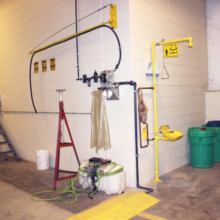
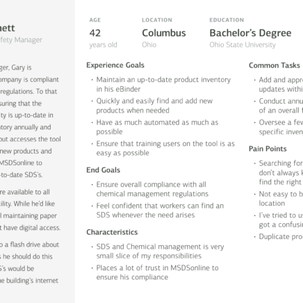
Early in the Discovery phase, we worked with this team to outline project goals and objectives that would give us benchmarks for success, including both near-term and long-term goals. We then moved into more strategic research that included persona definition, customer journey mapping, and ecosystem mapping. These would help us understand the various points of entry that sales and support had within the product, and inform design decisions, but also opportunities for client feedback. Fuzzy Math sat in on meetings to learn how the company onboarded new clients, listened in on support calls to hear the real-world pain points of users, and even embedded ourselves in the company culture and its processes for two full days to absorb its workflow. We then went out into the field to see how the product was used at everyday facilities like parks departments and warehouses, and we observed real users responsible for chemical management to better understand the ecosystem in which the product existed. Throughout we documented insights and obvious points of friction and frustration – both for VelocityEHS’s internal teams and its users – that would later become critical to resolve in the design phase.
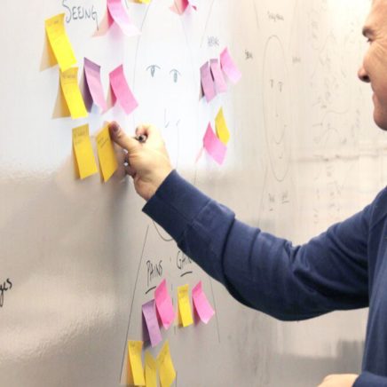
Discovery workshop at VelocityEHS
Concepting
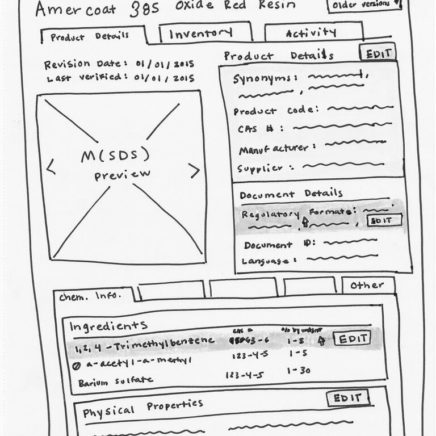
Once we collected the research necessary for understanding how VelocityEHS operated, we wanted to know: how did these pieces of information form a relationship within the system that ultimately benefited the user? We drew sketches, conducted analogous research about what other, non-chemical management companies were doing to solve similar problems, and hosted collaborative sessions with the goal of not only discussing concepts, but prioritizing them for impact.
Framework Design
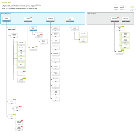
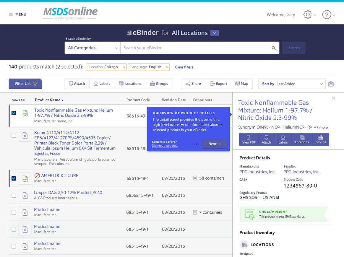
We then began building the structure of the system, including architecting information in order of importance to the user, developing navigational patterns, and a visual language consistent throughout the platform and across devices. During this project’s lifecycle, we weren’t just designing for visual appeal — we were designing for behavioral accuracy. As UX practitioners, we know that interaction design is a fine line between giving users what they say they need, and giving them what they don’t know they need. We wanted their experience using the platform to feel intuitive, and ultimately natural.
As we worked on building out the platform’s framework, we also began planning the way that complex chemical regulatory information would be displayed to scale across document formats and device sizes. We went through dozens of iterations, tweaking, simplifying, and improving as we went.
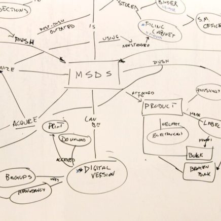
Ethnographic design research, Personas, Sketches, and Site Map Information Design
Design Sprints
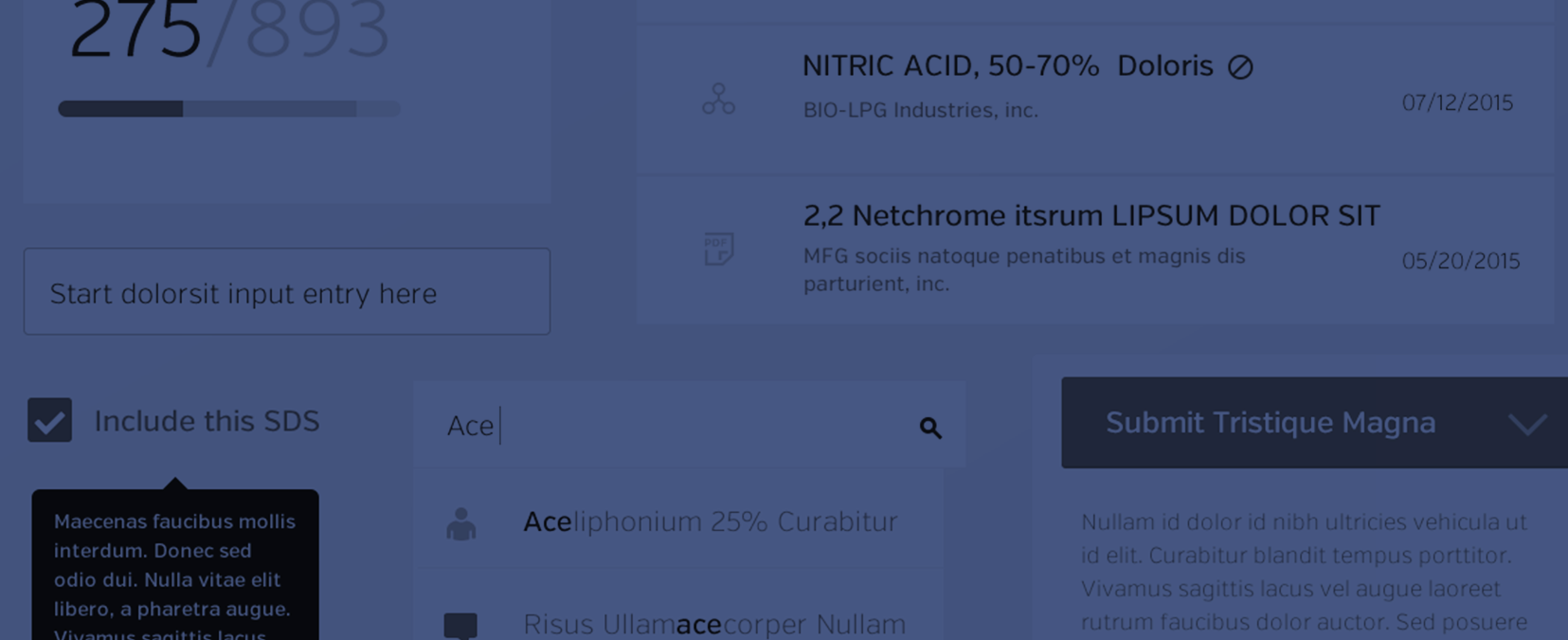
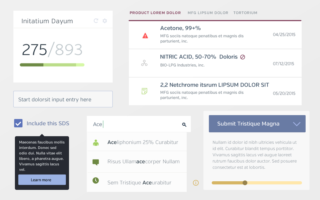
We then ran two overlapping design sprints, which allowed us to move features and pages within the platform from rapid sketch to bare-bones wireframe, and ultimately, to a final design. Our team collaborated with VelocityEHS during each of these stages to agree on concept sketch directions, then built wireframes and tested their interactive elements in tandem with the platform’s visual design, which we applied as full color page designs. Though these pages were complex with many states of information and specific user flows, we delivered a core set of UI elements and interaction patterns that could be replicated and repurposed throughout the platform, offering a consistent user experience no matter where users ventured, or what their level of expertise was.
Project Outcomes
With our research and design support, we upgraded VelocityEHS from its existing version 1.0 of the product into a more comprehensive, intuitive version 2.0 built for usability and longevity. We also gave its product team new systems for identifying patterns within user needs so that they could make decisions in line with the product’s strategy and vision, instead of reactive changes that served as temporary fixes to much larger problems.
Now, instead of being managed by outdated procedures and cluttered systems, employees can manage the chemicals they work with through a tool that feels like an extension of themselves exactly when and where they need it.

Have a project you'd like to discuss?
We'd love to speak with you about your project and how our user experience services can help.
Contact Us