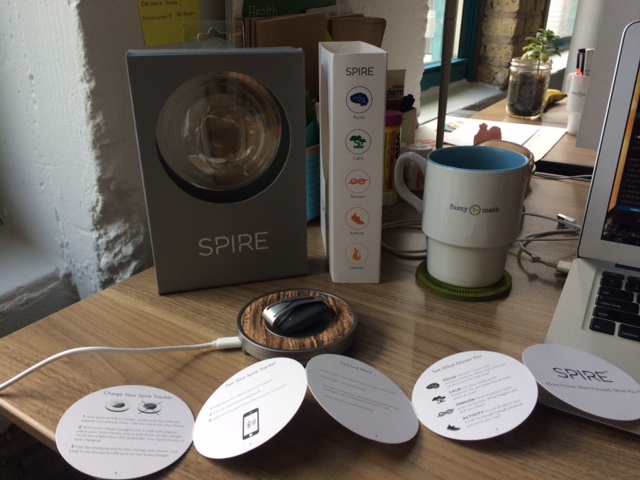
Like many congenital neurotics, I’ve always been interested in the idea of achieving mental clarity and focus. I do the yoga thing and I give time for meditation and mindfulness, which is why I decided that Spire —a scarab-sized clip-on wearable that measures and interprets metrics related to breathing and movement — seemed like it might be a perfect choice to suit my aspirations of being more Zen. It has now been one month since I started wearing the Spire, which seems like a good amount of time to give a report to the wearable-curious out there.
What does it do?
The Spire device, which is worn on the inner waistband of pants for men and is clipped to the bra on women, uses sensors to detect the respiratory movement of your body and streams that data in real time to a smartphone application.
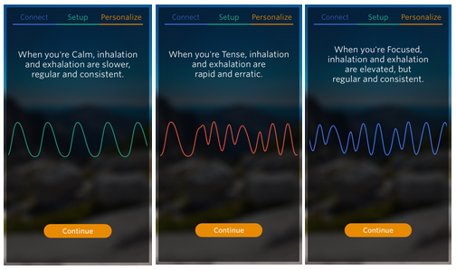
Through these physical inputs, it purports to measures three categories of feedback: calm, focus, and activity. Standard metrics available on other Wearables like a step counter and calorie burning ticker are augmented by charts and notifications that indicate periods of calm or stress, focus or distraction. For example, the app pushes notifications to the user when the Spire device detects a high degree of tension or when the user has been sedentary for an extended period of time. The degree to which the device and its associated app succeed as effective tools to promote mindfulness and healthfulness can be broken down according to the following key categories.
User-Friendliness
Opening up the box and getting it set up to begin providing feedback was a breeze. The system setup wizard for the iPhone app provided clear and direct instructions, and got me acclimated to the application quickly. The simple, straightforward layout made learning easy and got me rolling right away with most of the advertised and hoped-for tools within the application.
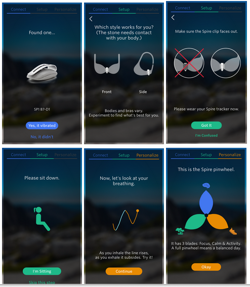
I also found that if I wanted to take advantage of some of the more complicated functionality and become a superuser, there are options for providing my Spire with greater amount of depth and detail that could help it better understand my daily activities. — For example, the app offers options to annotate events in my day and label periods of calm or productivity that will eventually improve the device’s accuracy.
On the whole, I would give the package high marks for user friendliness, but with a minor quibble when it comes to terminology — words like “boosts” (mini-tutorials and activities to improve calm, focus and energy) and “streaks” seem like they might be more suited to a game or an app geared toward fostering competition. Given the package is meant as a tool to keep centered, those details of wording might be considered for revision.
Design & Comfort of the Device
As a hopeless aesthete, the look of the device was hugely important to me and took precedent over considerations of fit and feel. I really didn’t want to have to wear something for the next few months that didn’t fit my style or make me feel like I was wearing a house-arrest anklet. I like that I can wear the Spire device under my clothing and clip it to my bra out of sight. When I do remove it, it is an attractive, matte-black scarab-sized clip that charges quietly on an elegantly-designed cork-inlaid wireless charge pad.The physical elements of the Spire package (device and charge pad) are all beautiful, and they lend to a zen sort of feel that is echoed within the design of the application, within which shapes and forms culled from the natural world take centrality.
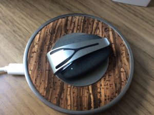
As for comfort, I don’t think I can offer any higher praise than to say that I couldn’t feel it at all. Clipped onto my sternum via my bra, it never moved once secured there, and at no point later on in a given day did it register to me that I was wearing a device.
Difficulties
Setup was simple, and wearing the Spire caused no problem, but this wearable isn’t all wine and roses. The major difficulty I had was that I believe it provided me with inaccurate or untimely data readings.
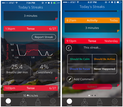
Most every day when reviewing my various notifications and readouts within the application, I was able to identify periods that had been incorrectly labeled, whether it was a stressful event in the day that went unremarked-upon by the app or a period of ease and calm that found me labeled as extremely tense. I’m hopeful that with time and by making use of the above mentioned option to annotate and correct the device’s findings, its performance will improve. Through this first month, at least, the Spire’s accuracy is suspect.
Battery
The battery for the Spire lasts about seven days, and charges in two hours. The wireless charge pad uses USB passthrough, which is all fantastic. The problem comes on the phone side of things: the Spire, which is gathering data on a constant basis, leaves my iPhone’s battery life in a shambles. Since I’ve started using the Spire, I have found that I need to charge my phone both throughout the workday as well as at night. What’s more, the application eats up a huge quantity of data, so anyone who is subscribed to a limited data plan needs to be very wary when away from a wifi connection.
Screen/Interface
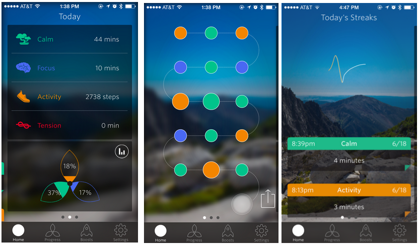
Overall, the interface design is clean and clear, the interaction is intuitive and pleasant, and the interface is remarkably uncluttered. Data visualizations in particular are attractive — a real time readout of breathing and tension metrics is represented by a single, gently undulating line.
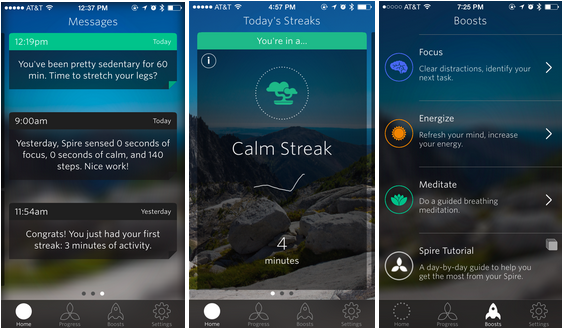
There are a few hiccups, however, as the spare design I so appreciate can occasionally lead to a lack of affordances. In one case, I stumbled upon a screen that seemed to have been available without visual cues or entry points. This particular screen, a road map visualization of recent feedback provided by the device, exists above the fold. To get to the screen, the user apparently must swipe down from the header, something I discovered only by accident.
In Summary: Is it meeting expectations?
In most ways but the most important, it is. The device and application are both beautifully designed and easy to use, and they purport to provide just the functionality and tools that I am looking for in order to improve my mindfulness. All of this, but for one simple flaw: I don’t yet trust the data. Talk to me again in another month or two once I’ve had a chance to “train” the application by providing more in the way of corrections and feedback, which will improve its ability to read my calm, focus, and activity. As a UX designer, I am impressed. As a consumer, I’m optimistic but withholding final judgement.
