Why I Chose The Misfit Shine
What I Hope It Does for Me…
The ultimate goal for me in using the Misfit Shine is to have a better understanding of my sleep patterns and what I can do to have a healthier sleep schedule — specifically relating to stress and migraines — ultimately helping me work and play better.
I would like it to be more than just data. Actually, I want it to be more like Data from Star Trek: smart with numbers, but has a human touch.
 Lt. Jenna D’Sora: This is all part of a program?
Lt. Cmdr. Data: Yes. One which I have just created for romantic relationships.
Lt. Jenna D’Sora: So I’m, erm… I’m just a small variable in one of your new computational environments?
Lt. Cmdr. Data: You are much more than that, Jenna. I have written a subroutine specifically for you – a program within the program. I have devoted a considerable share of my internal resources to its development.
Lt. Jenna D’Sora: Data… that’s the nicest thing anybody’s ever said to me.
I would like the data to help inform me of possible changes I can make in my day-to-day patterns in order to better my sleep. I hope my habits can change based on the data. I hope it is user friendly and low maintenance enough that I have to put in limited effort to get something from it. I don’t want to feel like I am wearing something; instead, I’d like it to act as it’s a part of me. It should be working for me, essentially — I am a busy lady!
De-Boxing
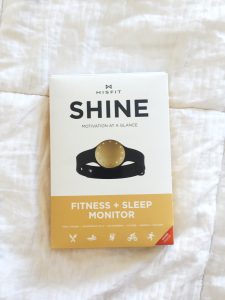 Package design is very nice! Marketing and design are well done. I am often tricked by these things. Easy on the eyes. I’ve been known to buy things based on packaging alone. So, up to this point, Misfit is doing well. It is very classy and feels premium. It feels like it has a lot to offer and that it is confident in itself, which based on packaging and design alone, makes me hopeful for its ability.
All the separate pieces are visually nice, including the tool to open the back of the coin to put the battery in. They applied a lot of thought toward making the actual wearable and how it is marketed aesthetically pleasing.
Setting it Up
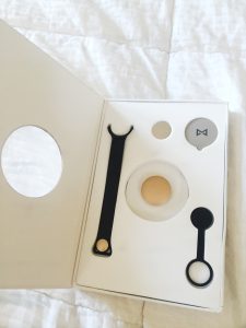 Hard to get coin in watch band
- Wasn’t quite sure if it was on or not after battery was in
- Tap to link was a bit confusing
- Slow linking procedure
- Asked me to rate app after just first opening it
- Got all synced – Now what do I do?
- The app is visually nice, but UX-wise kind of confusing and extravagant
- How do I manually sync? Hard to find on the get-go; buried a bit
The Details
User Friendliness
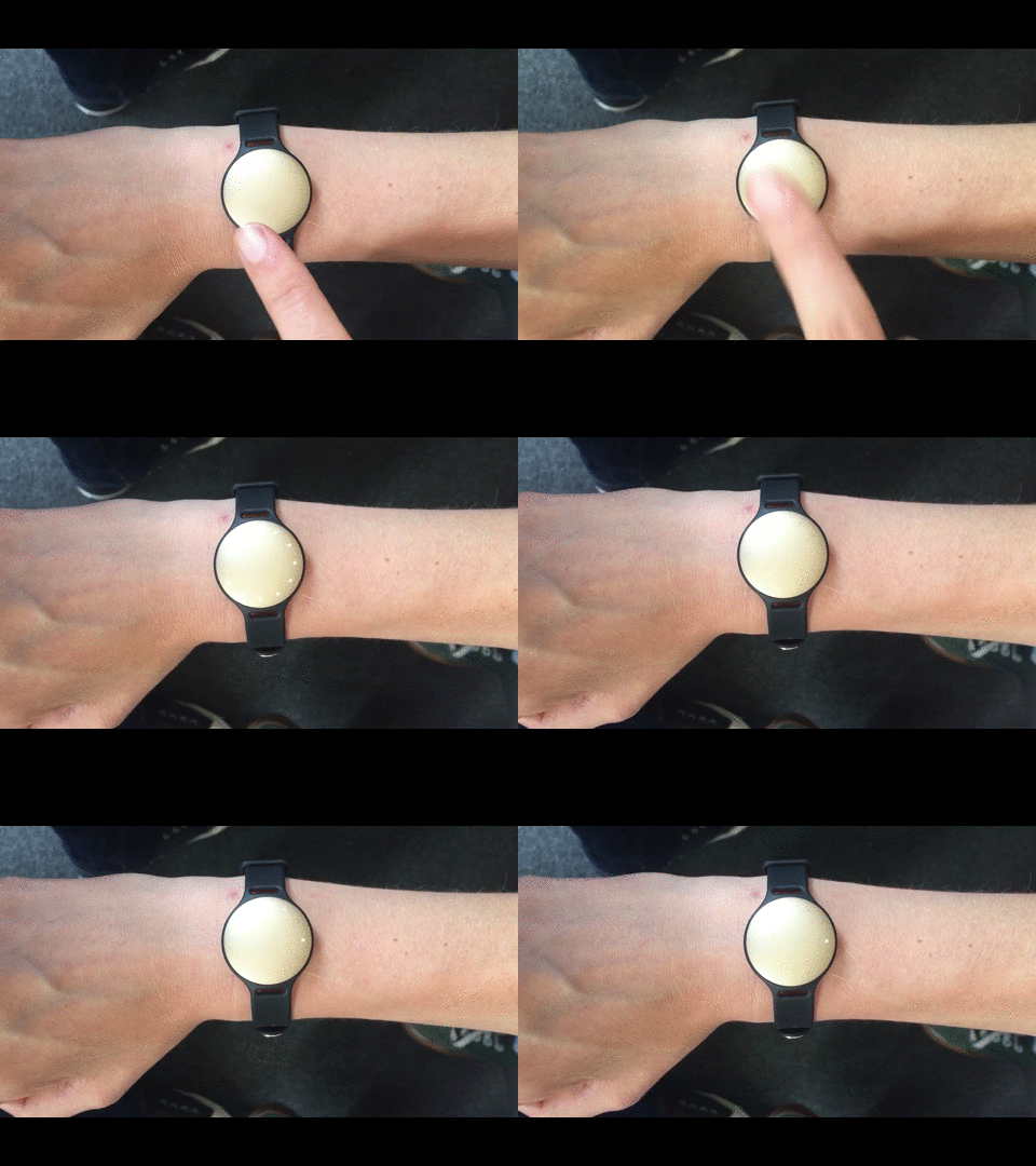
 Easy to wear, doesn’t get in the way. The tap feature to get the percentage of my goal and the time of the day is tricky. Sometimes it takes a few taps and hitting it just right for it to work. Also it is hard to see if you are outside and it is sunny out. The lights don’t illuminate very well when it is bright outside, which makes it useless outdoors the majority of the time.
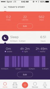
The iPhone app again looks nice, but it seems to me that the hip/trendy aesthetic of the user interface (UI) is getting in the way of the usability. Lots going on in the app, lots to look at, and lots of moving elements. The main ‘+’ action is to enter your own activity, which is the opposite of what I want to do with a wearable.
Why is the main action something I have to manually enter? I thought the purpose of wearables was to gather data without much work on my (the user’s) part.
Design/Comfort
 As someone who has a ‘Princess & the Pea’ level of fragility, any slight discomfort of my body will trigger me to remove the irritation in question. For example, at one time in my life, I shaved all of my hair off because it was so thick and heavy it hurt.
So when I say it is very comfortable, I mean it is almost undetectable.
I use the out-of-the-box band, which is made out of a lightweight soft rubber material. I can be a bit absent-minded when it comes to remembering to remove all accessories before showering or cleaning the fish tank, but lucky for me this baby is waterproof. If it weren’t, it would already be fried.
The design of the wearable is very sleek and beautiful. I’d be lying if I didn’t say it was one of the main reasons I selected this wearable from the competitors. It is a fashion forward, futuristic, martian-being accessory. Although it looks like it is from another planet, it was not designed in a vacuum. As to say, the Misfit team has a well designed and well-branded system, and didn’t just hone its design efforts on the device itself; they thought about every touchpoint. The website, packaging, app, and marketing elements all work together to help sell a lifestyle, not just a product.
The face of the Misfit Shine, or coin as I am ‘coining’ it, is a nice matte champagne color. I love the texture of the Shine and the size especially. I have small, dainty lady wrists, so I appreciate that the area it takes up is minimal.
The material of the coin is a soft metal and although it lies fairly flat on my wrist and only a centimeter high, it scratches quite easily (and it shows). Some people say scars build character, that they tell a good story, that may be so. The story my Misfit is telling right now is that: A) I am coming into contact with some rough terrain in my lightly active city routine, or B) The Shine still needs product tweaks to help its design appeal stay appealing as long as possible.
Difficulties
- Tapping the watch
- Doesn’t register naps
- Knowing if the data is legit
- Interacting with the data in the app (the graphs are not entirely obvious – What do they mean?!)
- Now what? I have data, but not quite sure what to do with it
- I have to move the coin to different areas of my body to register different activity types
Battery
The battery is a battery (literally). No charging needed; estimated to last six months. My partner has had two batteries die and Misfit simply shipped her batteries because they predicted it was about time for a replacement. And they did this for free. I’d be interested in knowing how long they will be doing this for their customers, or if I will need to order my own new batteries eventually. Currently, I have not had to think about charging and the performance has been fine.
Screen/Interface
The interface of the wearable itself is clean and minimalist. I like it because it is subtle and nondescript. When I need to see the time or where I am on step goal, I just tap it and it lights up to show me ‘data’ through 12 dots. In my opinion, it is very pretty and unique, very ‘designer-y’ & space-y, beam me up! Sometimes I’ll just tap it to see the lights go around. I mostly use my phone for the time/watch and don’t really care about my steps/activity goal, because I don’t feel it is that accurate.
The App
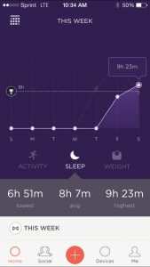 The app is so-so. It is visually sleek like the watch and ‘cool.’ It is very pretty but can be a bit confusing to use.
I wouldn’t say it is incredibly “user friendly,” as some of the data is not super obvious to interpret. It looks nice, but if you are actually interested in what some of the data means, it doesn’t tell you too much or allow you to dig much deeper.
It would especially help to know how it collects the data. The app itself doesn’t really help me decide what I should do to be a healthier version of myself moving forward (my ultimate goal), unless I’m simply missing some aspect of how to make it work better for me. If that’s the case, the app doesn’t do a very good job at directing me to a help section or a settings page where I can make it more effective. For sleep, I want to relate the data the app gives me to stress and migraines, but to do this I’d have to somehow compare this to other apps I have (which probably will not be very accurate). My other option would be to do a lot of guesswork, which I don’t want to do, nor do I have the time to do (I don’t want to be a researcher; rather, I want the Shine and its corresponding app to compile and comprehend the elements of data my body gives it and identify patterns that I can analyze and interpret in order to better anticipate migraines and improve my sleep).
*I tried fake swimming in the shower and tub to see if the water contact and movement would trigger it to think I was swimming, but that didn’t work.
Matching Expectations?
I guess I didn’t have super high expectations because most of these wearables are in their infancy. So if it didn’t impress me with data, at least I have a sleek looking space watch. I was hoping the sleep data would help me in more ways than just spitting data at me, like give me tips, etc. I am also disappointed it doesn’t read naps or random sleep times. That seems odd to me. Other than that, I wasn’t really looking for step count, but am interested in understanding the accuracy of this paired with the calories burned (it seems quite off). Also, comparing my Shine with my partner’s, the steps are different for us when we walked everywhere together. Curious to why this may be. Strides? Hardware? etc.
At this point, it is more like a glorified space watch for me. I am not sure what to do with the data or how much to trust it. It doesn’t guide me in any way or help me use the data in a way that would help change or guide behavior.
Use the Misfit Shine? What has your experience been with it?
