
Most Chicagoans have heard of Divvy – a network of bike rentals conveniently placed at 75 locations throughout the city – and many have even utilized this ground-breaking, eco-friendly commuting and sight-seeing alternative since it was introduced on June 28, 2013. Recently, Divvy released a massive pile of data and challenged everyday Chicagoans to analyze it, with the intended goal of presenting the data for the 750,000 trips taken in 2013 in visually compelling ways. They called it the Divvy Data Challenge.
Our very own Fuzzy Math team accepted the challenge, and what we discovered as we sorted through the myriad of data presented was much more than what the numbers told. Here’s a shot of what our team created:
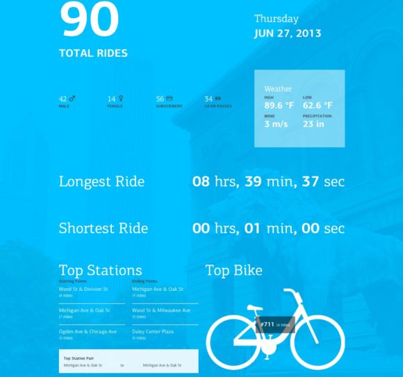
Fuzzy Math’s entry faced some pretty fierce competition (you should check out the winners sometime), and it served as a valuable learning experience for taking big data and putting it into meaningful form. User Experience (UX) Designers here at Fuzzy Math tend to appreciate the process, because it is in the process that problems are solved, questions are raised, and more ideas are inspired. Fuzzy Math UX Designer Nick Leonard said, “Any data, whether public or private, tells a story.” Read our interview with Nick below to get his take on working through the Divvy Data Challenge:
What are good questions to ask when starting to “look at data”?

When approaching new data, especially from an unfamiliar set, we’ll start by understanding the meaning of each field in the dataset. From there, we start looking at the relationships between fields, and understanding the overall system it represents. In this project, that was a fairly simple process as there was a limited set of easily understood fields.
What kinds of constraints were there in the process?
There weren’t a ton of constraints in this process, aside from time. The only thing I can think of is that there were a number of ideas we’d have liked to pursue, but lacked the data for, especially when thinking about ideas relating to specific riders (there was no way to tie multiple trips to a single person).
Sounds like there were some limitations in the dataset. How did you settle on what to show?
We liked the idea of bringing in some sort of external data that we thought would provide additional context for influencing factors, which led us to layering in weather data. Weather is an obvious factor in biking, so we were curious to see just how influential it would be on Divvy utilization. It’s also a relatively easy dataset to find publicly available (we got our data from NOAA’s National Climate Data Center website, www.ncdc.noaa.gov)
What’s your favorite part about looking at publicly available data?
Any data, whether public or private, tells a story. Uncovering trends, digging into details to try and get at correlations, and investigating hypotheses are all exciting parts of the process. With the Divvy data, it was fascinating to see the explosion in ridership from day one to peak times in the late summer, and to see just how far some riders were going on their Divvys.