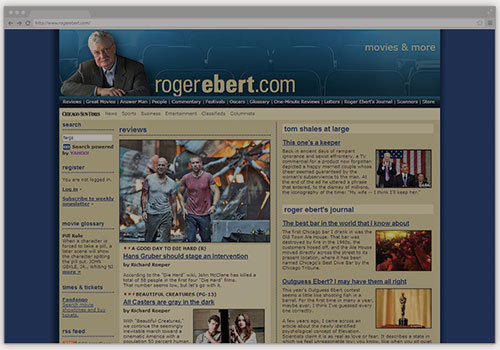
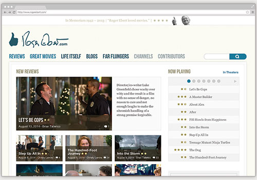
Partnering with Table XI, we helped create an easy-to-use portal for Roger Ebert’s extensive catalog of reviews and blog posts, as well as those of other authors in his network.
The Challenge
Before the redesign of RogerEbert.com, the site was difficult to navigate, making the wealth of excellent reviews, blog posts, and movie commentary hard to find and interact with. We worked with Chicago design firm Table XI, as well as Ebert Digital, to rectify this situation and ensure that the works of a man we all admire would be as accessible as his writing.
Industry
B2C
Our Expertise
Digital Product Strategy
UI/UX Design
UX Research
We focused on improving information organization, wayfinding, and search, sort, and filtering capabilities to ensure that whether you’re looking for Ebert’s review of Wet Hot American Summer, a Far Flung Correspondent’s blog post about a summer blockbuster, or the Smiles of a Summer Night Great Movies feature, it’s incredibly easy to find. We also designed the site responsively, to ensure it looked great no matter how you view it.

We started our redesign with a content audit, looking at every page of the old site and making note of what content was there — we wanted to make sure we didn’t forget about anything and leave it lost in the shuffle. Once we understood the content we were designing for, we combined that knowledge with Table XI’s user profiles and began sketching ideas for how we could arrange content in a way that would be both engaging and functional. By creating a handful of different ideas, we were able to hone in on the things that worked the best and refine them all into a single cohesive design. One area of focus for us was a movie review page, certainly one of the most important pages on the site. Through various design concepts, iterations, and reviews with the Table XI and Ebert Digital teams, we landed on an approach that made the review a central point for that movie, including everything you’d want to know about that particular film alongside Ebert or one of his contributor’s review.
As we worked through different pages and figured out which concepts worked best, we refined those concepts into detailed wireframes. Each wireframe outlined, for a given page, the information that would be on this page, how it’d be laid out, where advertisements would live, and how the page might reflow at different responsive breakpoints. These wireframes were reviewed by Table XI to ensure they met their functional needs, and by Roger Ebert to ensure they properly framed the site’s content. Once we got the thumbs up on design, Table XI was able to develop the site you see today. As fans of Roger Ebert, we’re thrilled that his incredible writing has such a nice home from which it will continue to be discovered and read.

Before

After
Have a project you'd like to discuss?
We'd love to speak with you about your project and how our user experience services can help.
Contact Us