Day 2 was full of more words of wisdom, awe, and inspiration, reaffirming my joy and appreciation for what I do everyday. I am not a very sporty gal, so being around this creative cheerleading was as close to a football huddle as I will ever get.
Territory
A creative agency whose expertise includes branding, motion, and digital design. The trio focused their talk around the UI they do in movies and films. Some of the notable films they have worked on are Prometheus, Guardians of the Galaxy, and Avengers: Age of Ultron. All of these films being fictional and futuristic, the group believes that what they do in films like these may influence future technology. I really connected with their ideology that every piece of technology has a personality, because something I try to achieve when designing tools is realizing their appropriate personalities.
Guardians of The Galaxy UI Reel from Territory on Vimeo.
For Guardians of the Galaxy, the personality of the UI was inspired by the main character of the film. His character was into 80’s pop culture, so they wanted the UI style to be “Alien tech meets 80’s retro,” and to have “analog warmth.”
Something surprising to me was that the process that went into making the UI components for Guardians of the Galaxy follows the same standard UX/UI design rules that we adhere to in this profession (with regard to hierarchy, interaction, labeling, typography, etc.). Where it becomes even trickier for a film is that the compositions need to follow rules and need to function as if they had a real interface, but they have an extra layer of troubles; the visuals need to work well in thumbnails, but all look beautiful when up close. They never knew when the director may have wanted to crop in close on something or have it be more of a textural piece in the background. Designing for both cases within one design is a feat!
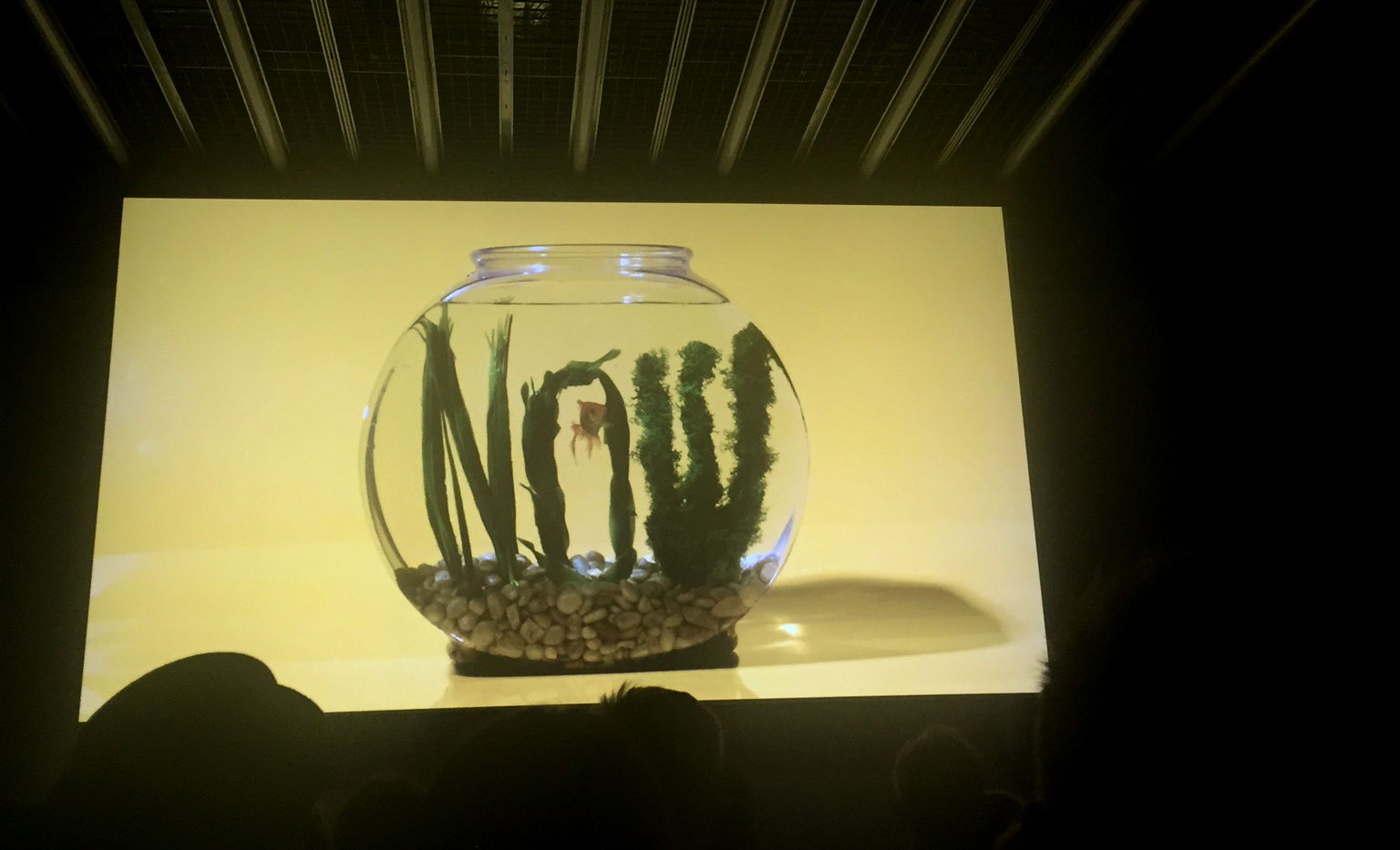
If you are in to data viz and component libraries, check out the modular sets for Guardians of the Galaxy. They are detailed beauties.
Anton & Irene
A two-person design duo out of Brooklyn — one UX and one visual — worked with clients such as USA Today, Sports Illustrated, and Waacom on re-imagining their websites. The two had their share of client relationship woes and had a lot of tips and tricks to give aspiring and veteran designers in the crowd:
- Control the feedback yourself: You know what feedback you need; you are the one that has to change it.
- Plan all features before production: Track and plan all features from the start; clients like the amount of clarity they get.
- Just do it: Sometimes you need to just attack it and do something the client didn’t ask you to do; it will sell the idea better.
- Nothing lasts forever: It’s sad when projects don’t turn out right, but…
- If you put crap in your portfolio… you will attract clients who want to do crap work.
Chuck Anderson

Chuck! Chuck is an artist/designer out of Chicago (represent!). He is a passionate, humble dude and straight up cheerleader for bootstrappers. You have probably seen his work and had no idea, as he is a very prolific maker and doer of things (have you ever seen this before?). He started his own freelance business at a very young age, literally looking in design and editorial type magazines, finding email addresses to art directors and such, and just emailing them his work and asking for a chance. As he says,
“If you do something, something will happen.”
The thing I liked about Chuck is that he didn’t go to college or have any formal training, he just learned by doing. He used Photoshop as his canvas and created things non-stop. I can relate to this need and urge to create, which I am sure a lot of designers can — it is a compulsion. He can remind us designers to chill out sometimes, and have some fun every once and a while; enjoy what you do.
One example of his manifesto is a recent opportunity he had with the Chicago Bulls and their instagram account. He basically had an idea for an artist takeover of the account and just asked to do it. You could say he took the bull by the horns. It involved a lot of Lightroom presets before the game, practice shots, running around like a mad man taking photos with photographer Jason Peterson, live from the game, applying the filters from his laptop and live tweeting the results.
Stefan Sagmeister
Stefan Sagmeister from Ministry of Culture on Vimeo.
I would be lying if I said Stefan Sagmeister’s involvement with the OFFF conference wasn’t the bourbon-cherry atop the sundae for me. As an angsty designer in college, Stefan’s work always resonated with me. He took risks, especially in his personal work, which is raw (in the sense that it is passionate and fresh).
His keynote was less about himself and more about a call to action for all the creators in the room. He was taking a stand and his direction was clear: we were to “make beauty our concern.” I will not be able to do his talk justice since it was a history lesson in itself and focused on architecture at its core, but the key take away was that having a relentless sense of functionalism does not work for humans. “Beauty is part of what makes us human.” He claimed that “international style” of architecture ruined authentic styles of architecture, in that if you were plopped somewhere in the world you would have no clue where you might be based on local architecture.
Sagmeister states that beauty can be functional, a statement with which I agree. He talked about Moscow train stations, and how they are all designed in ornamental ways; completely different at every stop, upping the ease of scannability of knowing which stop you are at without looking at signage.
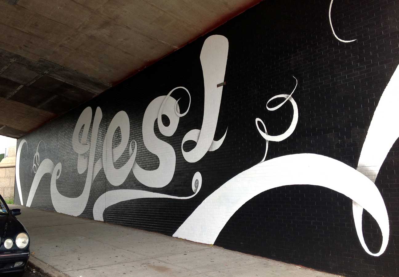
He also had another example of where beauty can change the perception of a space or thing. A Brooklyn bridge that was known for questionable activity simply had a mural painted on it that said “Yes.” Soon, people stopped peeing on it and started getting married in front of it.
As a UI designer in a user’s world, we strive for making tools and applications more human. A little beauty goes a long way in this regard. Challenge accepted, Mr. Sagmeister.
Stay Tuned
In my next post, which recaps Day 3 of the conference, I will introduce you to the works and thoughts of Jan De Coster, Laika, and Pat Perry.